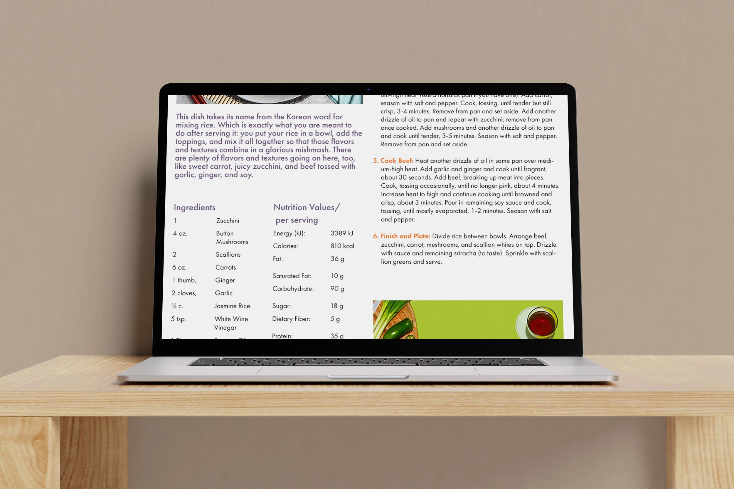
Cookbook Spreads and Webpage

For this project, the objective was to create two spreads for a cookbook. I used a five-column grid for this layout and added a side bar to one recipe. Through hierarchy I was able to show the levels of importance for the text. I added circle icons at the beginning of the page to indicate special tags for the recipe. Along with the large picture of the final dish I also added smaller images of the food being prepared and used the fresh vegetables to determine my color scheme. Through the design process I wanted to make a layout that was clean and vibrant.

Webpage

For the webpage I had to adjust the sizes of text to make them bigger for the web and make the style unified to my cookbook. Thinking about responsive liquid design I decided to put the intro text, nutrition, and ingredients in the left two columns, while putting the instructions and ad on the right. This helped the typographic hierarchy as well as increased the organization and legibility. I added my print and share buttons toward the top with user experience in mind.
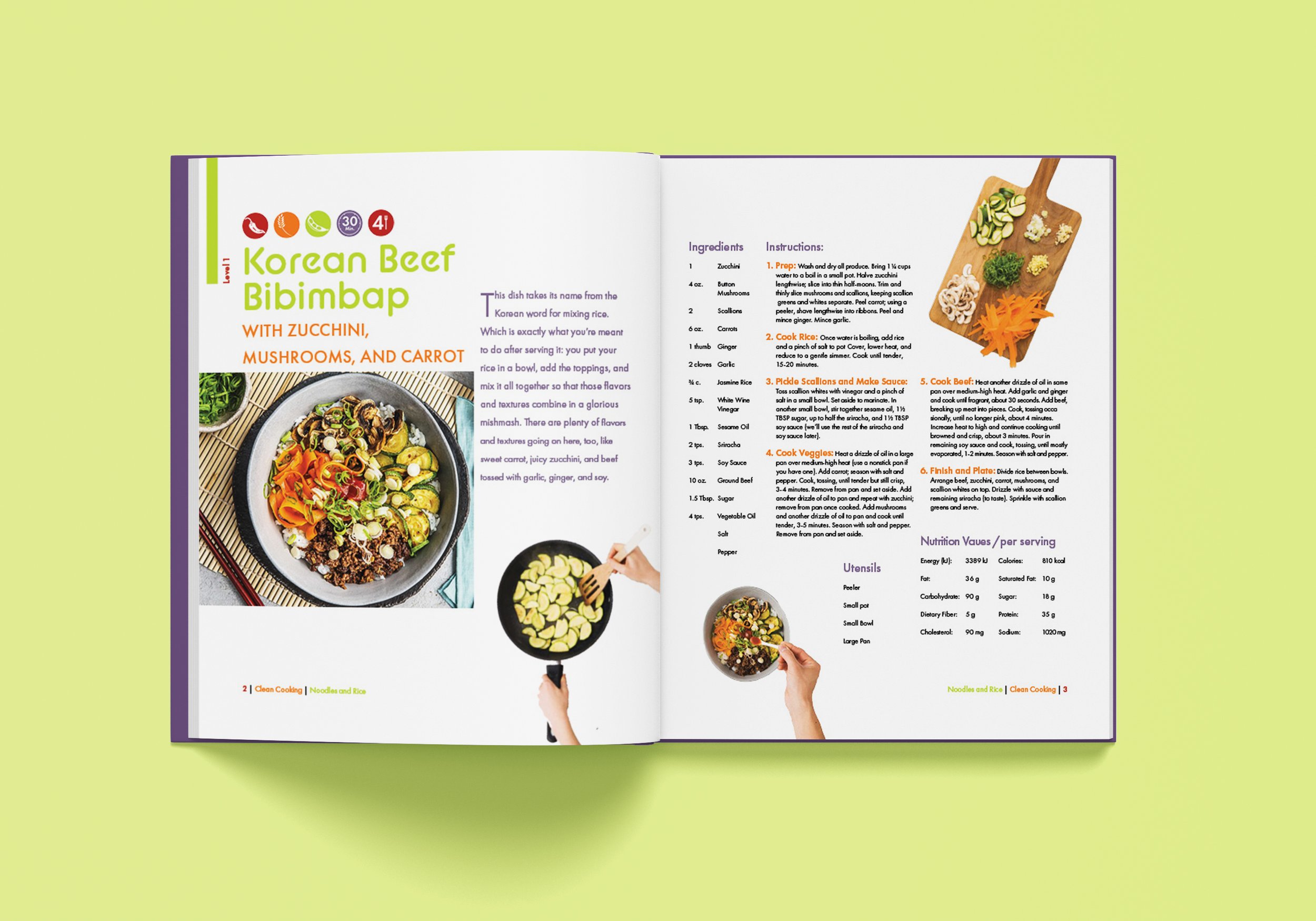
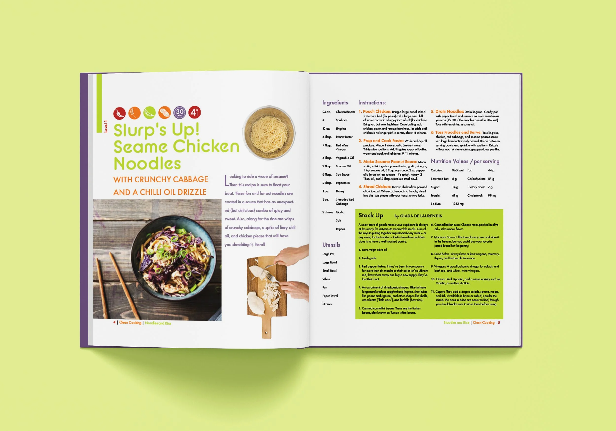
Process Images

Previous
Previous

Typographic Metaphor