Lindt Rebrand and Brand Guidelines
The goal of this project is to rebrand an existing product or service. For this project I chose the brand Lindt because I have a major sweet tooth. With the research I conducted I found that the company is a traditional brand and is targeted toward women aged 35-60 who have a high household income with families. Though many enjoy gifting chocolate, people have become more concerned about ethical practices in their food. For this project I felt it was important for the brand to focus how the company has a mission of fostering better agricultural standards for labor in origin countries.


I created a warmer inviting theme, with pops of green hinting toward the new ideals. In my design I focused on how I could add an aspect of nature while creating something that felt modern and luxurious. Picking a unique angular serif typeface spoke to the luxury and modern take for the brand and represent the sustainability standards the brand has taken on. Finally, I changed the tagline to “Fostering Sustainable Chocolate” to highlight the reactive thinking the brand has shown.


Lindt Rebrand Website
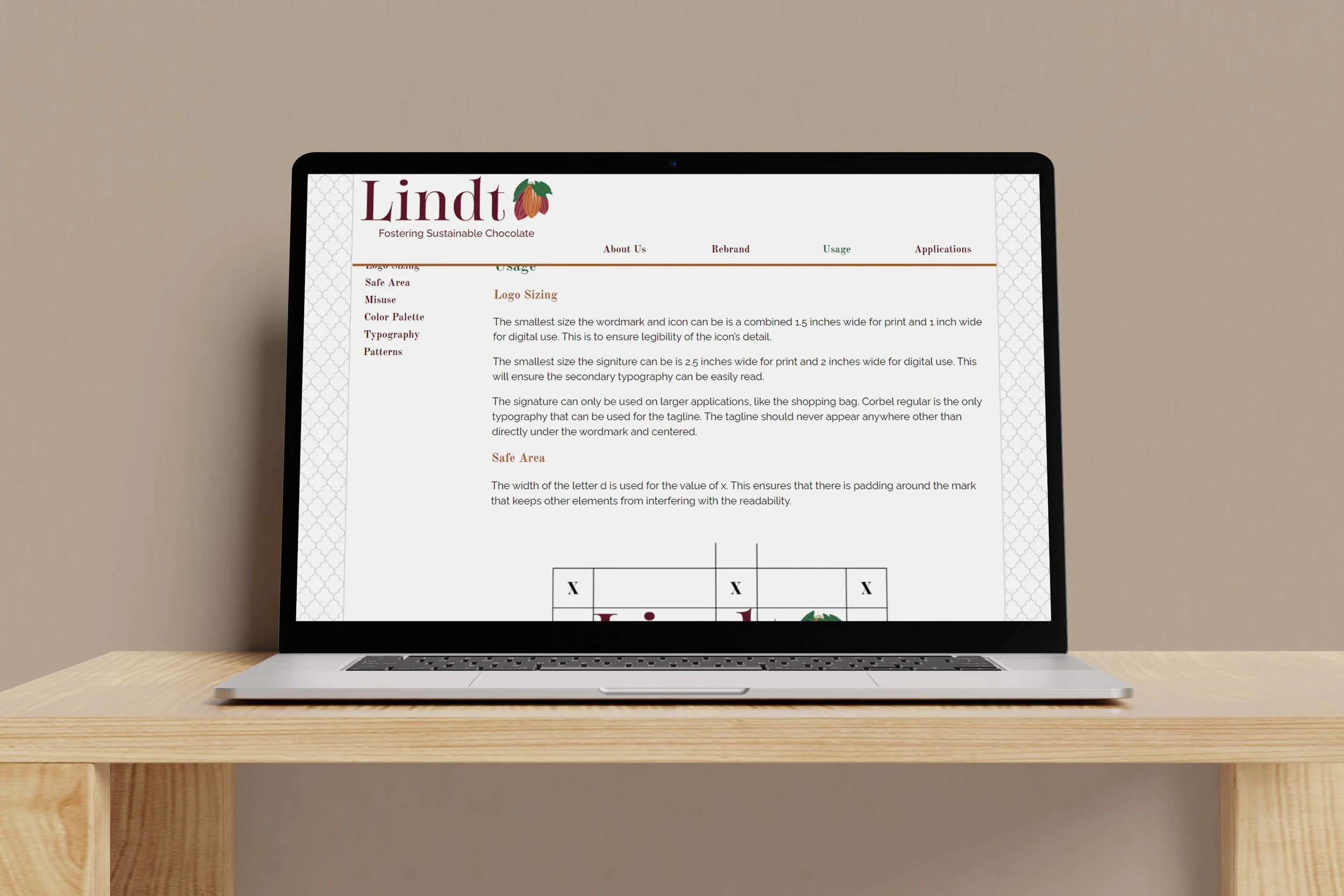
For this project I had to create a website that extended a past project. For this website I had to consider the consumer and the branding goals. The site needed to look mature and carry the ideas of a product marketed towards the luxury chocolate market. The color scheme of the site was mostly white with the tiled grey and white background with pops of colors included for a clean look. To achieve good legibility and usability, all my body copy was styled with a sans serif, and I added a sub navigation to the interior pages. Adding a sticky banner and a “you are here indicator” was an additional way I made the menu easy to navigate. I had to think about how to create a cohesive flow throughout the site. Putting the mission and vision statement on the homepage helps to display the brand's values and indicate the ideas that inspired the rebrand. I added social media links, a site ID, and fragments on longer pages to decrease scrolling.