Personal Exhibit Collection
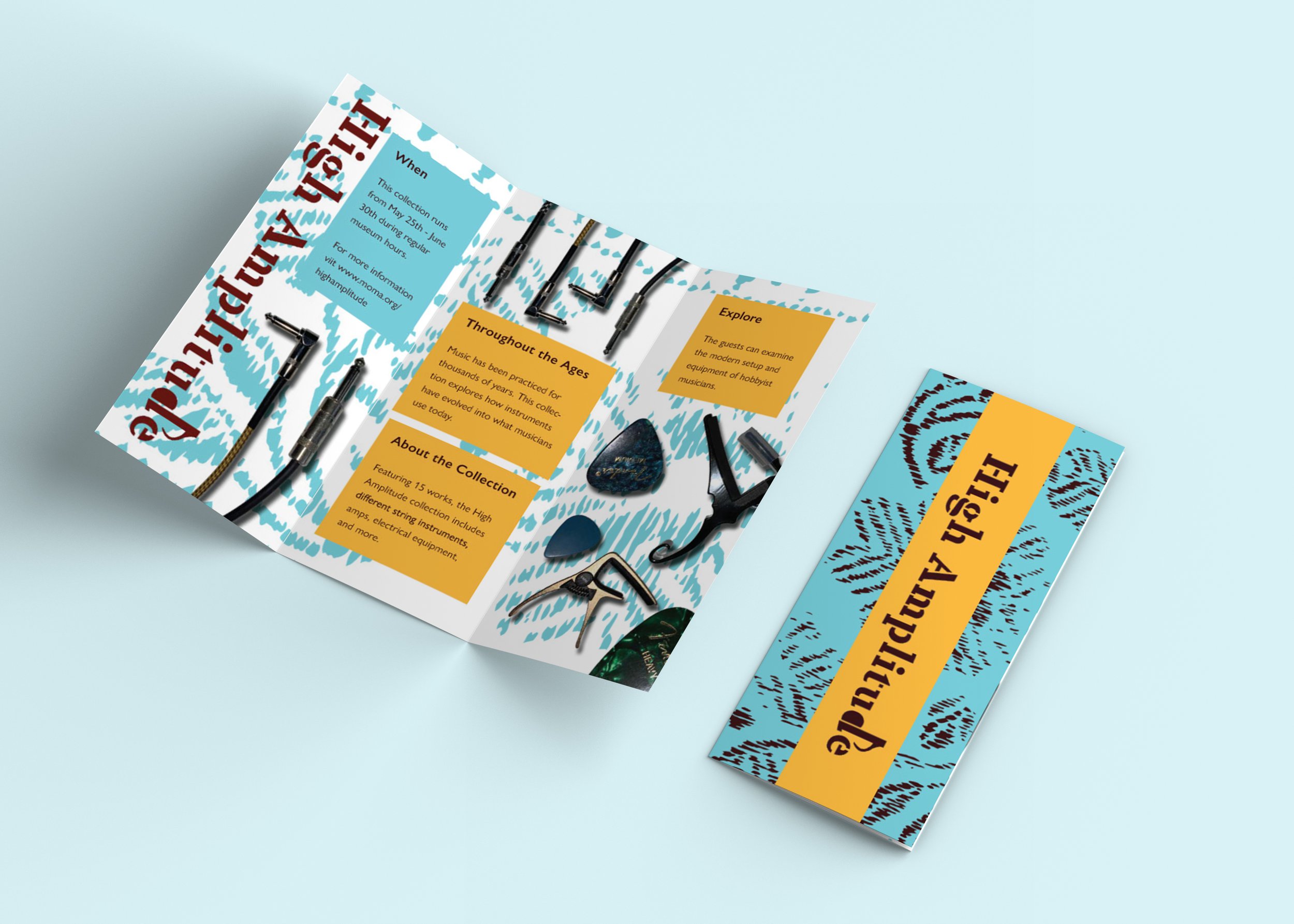
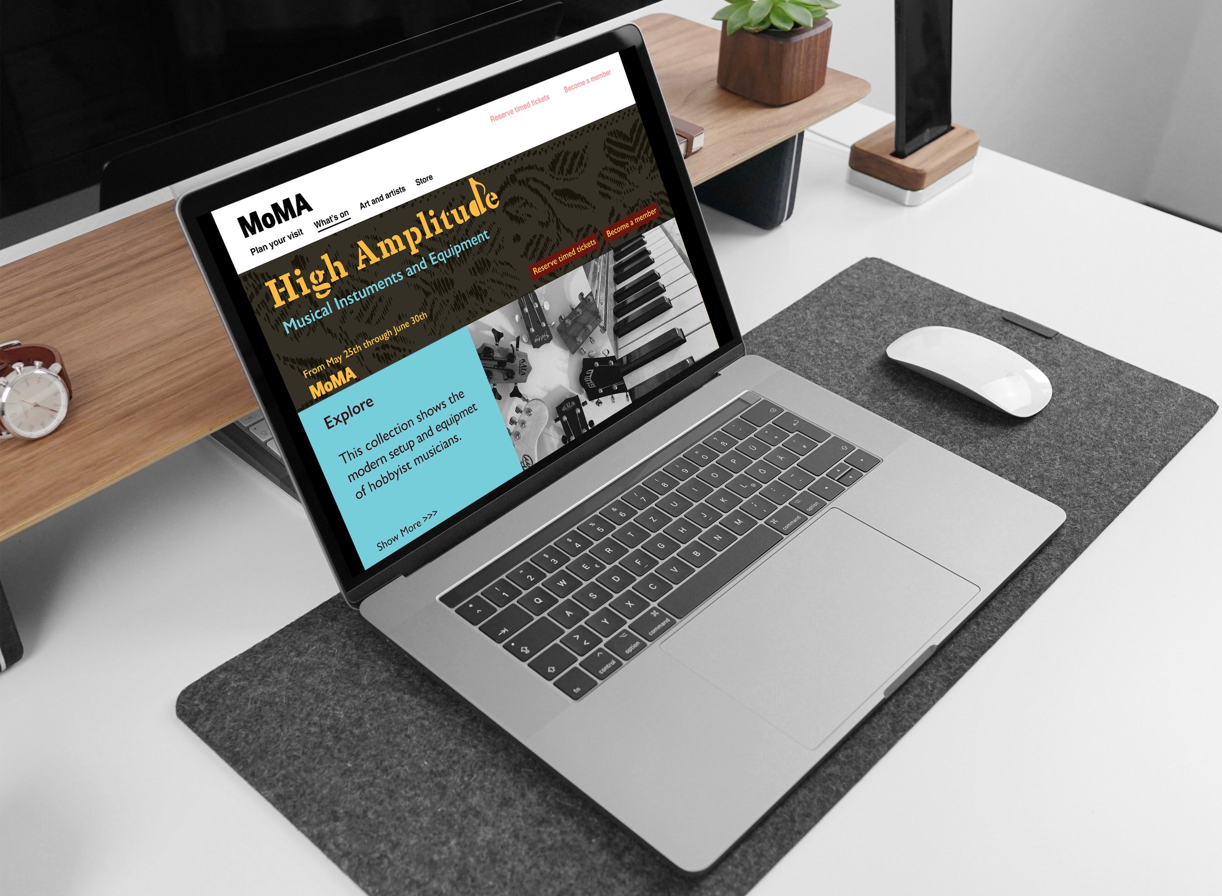
In this project the brief was to create an exhibition identity for a collection of at least 15 items. For my collection I chose to document my musical instruments and equipment. I first created a word mark that had a music note on one of the letters to make it simple, but also clearly show what the collection is about. Throughout the poster, brochure, website, and Instagram posts I used the same pattern, but changed the color and layout. This helped create a sense of unity in all the works to make a connection between them all. As I took pictures, I tried to capture different angles and positions of my objects and then cut them out in photoshop. To be successful I used techniques like activating the diagonals, typographic hierarchy, and photo editing.


